


Tayco Office Furnishings Inc.
400 Norris Glen Rd.
Toronto, ON M9C 1H5
T: (416) 252-8000
T: (800) 675-4092
F: (416) 252-4467
[email protected]
Choosing the right Damask Labels means balancing appearance, durability, and brand fit. The woven surface can add depth to a small label, while fine lettering may lose clarity if the weave is too dense. Consider where the label will sit: a jacket collar, a soft waistband, or a neatly folded hem. Each placement changes what customers see and feel.
The wider label market offers useful context, but not a guarantee of success. Grand View Research estimated the global printed labels market at about USD 45.4 billion in 2023. That figure covers printed labels broadly; it does not measure the damask segment alone. Still, it signals how much attention brands give to product identification and presentation. And there is a catch. Market growth cannot tell you whether a specific label will feel comfortable against skin or keep its details after repeated washing.
Textile designer William Morris offered a lasting design principle: “Have nothing in your houses that you do not know to be useful, or believe to be beautiful.” For Damask Labels, both tests matter. A sample should look refined under bright showroom lights and remain legible in a close-up inspection. Check thread contrast, weave density, cut edges, fold style, and label dimensions against the garment itself. Ask for a physical sample, not only a digital mock-up. Small differences can matter. This guide explores how to compare materials, artwork, finishes, and suppliers with practical criteria. Some choices still involve judgment; the most expensive option is not automatically the best one.
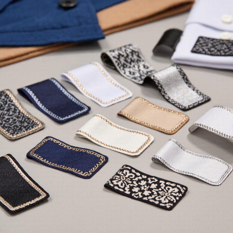
Damask labels are woven, not simply printed, so their material and weave affect how a design looks and feels. Polyester yarn is common because it holds fine details and resists everyday wear. Cotton can offer a softer, more natural feel, though small lettering may appear less crisp. The right choice depends on the garment, care routine, and label size. Feel the surface. A dense weave should look even, with clear lettering and no loose threads.
Tips: Request a physical sample before approving production. Check it under ordinary indoor light, then bend and rub it gently. Look for legible small text, stable edges, and a comfortable hand against skin. Ask how the label is expected to hold up after washing; results can vary with fabric, detergent, and care conditions.
Weave density matters as much as fiber. A tighter damask weave can reproduce fine lines and compact text, while a looser structure may soften details. Very small artwork can still lose definition, even on a quality label. That part is easy to overlook. Match the artwork to the available label area, and compare thread colors against the actual garment rather than a screen image. Consider edge finishing, too: folded edges can feel neater, but add bulk, which may not suit lightweight clothing.
| Option | Material and Construction | Appearance and Detail | Hand Feel | Best Suited For | Key Consideration |
|---|---|---|---|---|---|
| Fine damask | Closely woven yarns, commonly polyester; the design is formed by interlacing warp and weft yarns. | Supports small lettering, fine lines, and detailed woven artwork when the design and weave are compatible. | Usually smooth, with a relatively compact surface. | Garments and accessories where legible care, size, or decorative details matter. | Very small text still needs adequate size and contrast; request a woven sample to check readability. |
| Standard damask | Woven construction using colored warp and weft yarns; polyester is a widely used fiber for woven labels. | Creates an integrated woven design with a clear balance of detail and readability. | Generally soft and flexible, though feel varies with yarn and construction. | A broad range of clothing labels and sewn-in product identification. | Confirm finished size, fold, and edge treatment alongside the artwork. |
| Satin-weave label | A weave structure with longer yarn floats that can produce a smooth, lustrous face; often made with polyester yarns. | Has a noticeably glossy surface. It is a weave choice, not a separate fiber type. | Smooth and fluid; the surface may be more prone to snagging than a tighter construction. | Decorative labels where a sheen and soft drape are desired. | Check how the surface performs in the intended location and during wear and laundering. |
| Recycled polyester yarn | A fiber-content choice that can be woven into a damask construction; recycled content does not describe the weave itself. | Appearance depends on yarn, weave, color, and finishing, rather than recycled content alone. | Varies with the same construction factors as other polyester yarn labels. | Products with a specified recycled-fiber material preference. | Ask for documentation of recycled content and check whether it meets applicable sourcing requirements. |
| Cotton yarn | A natural-fiber option that may be woven into labels; fiber choice and weave construction are separate decisions. | Typically has a more matte, textile-like look than a lustrous satin surface. | Can feel soft and familiar, depending on yarn and finishing. | Labels where a natural-fiber look or material specification is preferred. | Check colorfastness, care performance, and the supplier’s exact fiber-content information. |
| Taffeta woven label | A comparatively simple woven construction, often made from polyester yarns; it is distinct from fine damask. | Usually has a simpler surface and is less suited to very fine woven detail than fine damask. | Can feel firmer or more textured, depending on the construction. | Straightforward identification information where intricate detail is not essential. | Compare a physical sample if softness or fine text is a priority. |
Selection tip: Evaluate fiber content, weave, finished label size, fold, edge treatment, readability, and care performance separately. Request a physical sample when hand feel or small woven details are important.


